Logo designer for satirical tech podcast and blog

  • Estado: Closed
  • Premio: $200
  • Propuestas recibidas: 6
  • Ganador: trying2w

Resumen del concurso

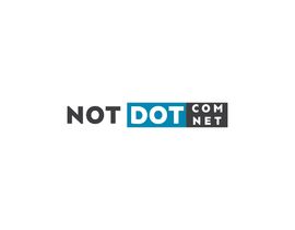
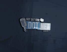
I need a logo that is humorously ambiguous for a podcast + blog I'm creating. The name of it is "Not Dot Com, Dot Net" and the website is notdotcomdotnet.com

The email address I'll be using is atatat@notdotcomdotnet.com

It's a dumb joke to launch a lot of dumb ideas, but the crux of it is it's pretty terrible when you say it out loud. "You're listening to not dot com, dot net. You can find us online at not dot com dot net dot com." I'd like the logo to be similarly infuriating and useless. I'd like a square logo as well as a typographic text-based one, if at all possible.

Habilidades recomendadas

Comentarios del empleador

“@trying2w won the contest on 28 August 2018”

Imagen del perfil notdotcomdotnet, United States.

Principales propuestas de este concurso

Ver más participaciones

Tablero de aclaración pública

  • notdotcomdotnet
    Organizador del concurso
    • 5 años atrás

    Wow. Thanks, everyone for educating me on overused logos. I'm rejecting all that fit with https://overusedlogodesigns.wordpress.com and will make my final decision very shortly.

    • 5 años atrás
    1. bassmanjazz
      bassmanjazz
      • 5 años atrás

      So close! :D Thanks for the contest and good luck with your project.

      • 5 años atrás
  • notdotcomdotnet
    Organizador del concurso
    • 5 años atrás

    Thanks for all the entries so far, y'all!

    Some good things I'm seeing: unique visual elements, playfulness with the way someone would read the logo.

    Some things I'm not loving: generic logos just put alongside text, text that doesn't align well with the visual elements, text that goes after other text elements which make it hard to read what the logo is trying to say.

    Things I'd be interested in seeing tried: playing with negation operators from programming (! for not, or \ which escapes / invalidates a single character). For instance:
    - \.
    - !(dotcom).net

    • 5 años atrás
    1. notdotcomdotnet
      Organizador del concurso
      • 5 años atrás

      Hi Faisal, would you mind elaborating? I would happily defer to an expert opinion if you think my judgement is off! The reasons I like the 5-star ones in particular are they work well with or without the text (the "DOT NET" part looks solid as a logo on its own), the whole thing reads correctly from left to right and top to bottom with the text, and it works well both in a two-color and monochromatic scheme.

      • 5 años atrás
    2. bassmanjazz
      bassmanjazz
      • 5 años atrás

      I think the person who wrote that mesagge delete the post. But let me clarify this for you, there's a list of generic designs that looks like MANY brands done by irresponsable designers (a brand should never look like other ones because attends to different needs, reflects different concepts, etc.), and the one you rate 4 stars is in it: https://overusedlogodesigns.wordpress.com/

      • 5 años atrás
  • Marcoslanister
    Marcoslanister
    • 5 años atrás

    Hello, be careful with generic logos

    https://overusedlogodesigns.wordpress.com/

    • 5 años atrás
  • renansalles
    renansalles
    • 5 años atrás

    Hello, you can check out the inscriptions #169 #170. They are fun projects, however modern and flat.

    • 5 años atrás
  • hossainsajjad166
    hossainsajjad166
    • 5 años atrás

    please check & feedback, #124 of # 163 thank you.

    • 5 años atrás
  • renansalles
    renansalles
    • 5 años atrás

    Hello, you can check the entries #121 #122 #123 . They are modern designs, clean but with the funny touch you need.

    • 5 años atrás
  • kazisydulislambd
    kazisydulislambd
    • 5 años atrás

    Please check my entry #116 #117 #118 #119

    • 5 años atrás
  • kazisydulislambd
    kazisydulislambd
    • 5 años atrás

    Please check my entry #110 #111 #112 #113 #114 #115

    • 5 años atrás
  • notdotcomdotnet
    Organizador del concurso
    • 5 años atrás

    In the interest of keeping the front page clear and easy to read, I'm going to temporarily "reject" multiples of the same image -- that doesn't mean I don't like them or appreciate them. I'm just getting more submissions than expected and I want it to be easy for people to see a variety of submissions rather than just the top few in different display schemes.

    • 5 años atrás
  • notdotcomdotnet
    Organizador del concurso
    • 5 años atrás

    Entries that are blatant ripoffs of existing designs will be rejected without consideration. If I want an iteration on someone's original design, I'll encourage them to resubmit.

    • 5 años atrás
    1. notdotcomdotnet
      Organizador del concurso
      • 5 años atrás

      I want to clarify: I'm ok with a clearly different take on something. I was just seeing a handful that were not more much than a recolor of existing designs!

      • 5 años atrás
  • mdmomin01720
    mdmomin01720
    • 5 años atrás

    sir plz checkd entry #78 #84.thank you

    • 5 años atrás
  • JamesArq
    JamesArq
    • 5 años atrás

    I am absolutely in love with the brand. I love how such a simple idea brought such a big grin on my face. I'm definitely going to be submitting an entry! Hoping to partner with you on this project.

    • 5 años atrás
    1. JamesArq
      JamesArq
      • 5 años atrás

      Hi! I've uploaded an entry, I would love to hear your thoughts on it. entry #33

      • 5 años atrás
  • vasked71
    vasked71
    • 5 años atrás

    #30, thanks

    • 5 años atrás
  • Odhoraqueen11
    Odhoraqueen11
    • 5 años atrás

    Please check my entry #23#24#25#26#27#28

    • 5 años atrás
  • lavamonkey
    lavamonkey
    • 5 años atrás

    Sorry, accidentally withdrew my entry. Re-submitted.

    • 5 años atrás

Mostrar más comentarios

Cómo comenzar con los concursos

  • Publica tu concurso

    Publica tu concurso Fácil y rápido

  • Recibe montones de propuestas

    Consigue toneladas de propuestas De todo el mundo

  • Elige la mejor propuesta

    Elige la mejor propuesta ¡Descarga fácilmente los archivos!

Publica un concurso ahora o únete a nosotros hoy