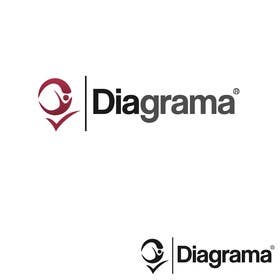
Logo Design for Diagrama
- Estado: Closed
- Premio: $290
- Propuestas recibidas: 42
- Ganador: eyedezign

Resumen del concurso
The company "Diagrama" is a business management consulting. We implemented the model and the Japanese management techniques. The brand must have a "Q" (which means quality) as an icon that can be in any position. We work with research
Habilidades recomendadas
Comentarios del empleador
“@eyedezign won the contest on 22 February 2013”
![]() fabiodia, Brazil.
fabiodia, Brazil.
Tablero de aclaración pública
-
malakark
- 11 años atrás
CONGRATULATION !!! eyedezign
- 11 años atrás
-

eyedezign
- 11 años atrás
Thanks malakark :)
- 11 años atrás
-

xahe36vw
- 11 años atrás
Congratulations #eyedezign :)
- 11 años atrás
-
eyedezign
- 11 años atrás
Thanks xahe36vw :)
- 11 años atrás
-
eyedezign
- 11 años atrás
HI fabiodia . Please check my private message . Thanks :)
- 11 años atrás
-
amin90
- 11 años atrás
good job all
- 11 años atrás
-

BrunoLobo
- 11 años atrás
My uploads fail. And the contest time end! I've got more 30 files to upload. Please extend the contest.
- 11 años atrás
-
BrunoLobo
- 11 años atrás
#939, #940, #943, #944, #945, #946
Please read my PM "BrunoLobo". Best Regards.- 11 años atrás
-

ceomasum
- 11 años atrás
Sir please chk PM. Thanks
- 11 años atrás
-
xahe36vw
- 11 años atrás
Hi I think #665 #666 more specific and modern, professional, unique, and this is my creation. I really appreciate your assessment, because it's important for me to develop.. Regards - Hexa :)
- 11 años atrás
-
eyedezign
- 11 años atrás
Hi fabiodia . Just needed to bring you the fact that I'm the one who originally brought the idea of using a human figure in the design "Q" . Now I see some designs with the same concept which are at the top , which were submitted after mine. I'm not pointing my finger at someone but it's not ethical . Hope you would consider this fact . Thanks :)
- 11 años atrás
-

Designerslook
- 11 años atrás
sir please check #913, #914, #915.thanks.
- 11 años atrás
-
ceomasum
- 11 años atrás
Sir please chk PM, we got more design. Waiting for your feedback. Thanks
- 11 años atrás
-

tiffont
- 11 años atrás
#902 please and thank you
- 11 años atrás
-
ceomasum
- 11 años atrás
Sir another one #901. Please chk you private message. Thanks
- 11 años atrás
-

indraadiwijaya
- 11 años atrás
Kindly rate #893, #894, #895.
Thank you.- 11 años atrás
-
ceomasum
- 11 años atrás
Everyone here. Sorry for inconvenience. I have a fund rising campaign. Please have a look on the link below. If possible then please help this guy thanks in advance.
http://www.facebook.com/photo.php?fbid=600636539950514&set=a.590612277619607.148917.590595120954656&type=1&theater
Thanks- 11 años atrás
-
ceomasum
- 11 años atrás
Sir waiting for your kind consideration.... another one submitted. Please chk pm. Thank you sir
- 11 años atrás
-
ceomasum
- 11 años atrás
Sir i am hoping some ratings for my submission #886, #870, #874, #875, #880, #881, #882, #884, #885, #886. Please chk ur PM. Thanks
- 11 años atrás
-
ceomasum
- 11 años atrás
and entry #887 as well. Thanks
- 11 años atrás
-
ceomasum
- 11 años atrás
Sir please chk pm. More coming up... thanks
- 11 años atrás
-

LAgraphicdesign
- 11 años atrás
Hello Sir. Please check my entry #883. Thank you.
Best Regards
LA- 11 años atrás
-

Dilyana23
- 11 años atrás
Hello :) please consider #872 and #878.. Thank you!
- 11 años atrás
-
ceomasum
- 11 años atrás
Sir another entry to win the contest #875. Please chk pm
- 11 años atrás
-
ceomasum
- 11 años atrás
Sir here is another one #870. Please chk pm. regards
- 11 años atrás
-
ceomasum
- 11 años atrás
Dear sir, please feedback for #862
- 11 años atrás
-
ceomasum
- 11 años atrás
Please rate #866, and check pm. Thanks
- 11 años atrás
-

vjmaxheight
- 11 años atrás
Please rate #860
- 11 años atrás
-

Ohtas
- 11 años atrás
Check pls the #859
- 11 años atrás
-
dworker88
- 11 años atrás
Z
- 11 años atrás
-

webinx
- 11 años atrás
Please Check #852 and #853
The logo was designed to be simple yet brandable. You can see the "Q" was made in such a way that it represent a sort of trophy and this will symbolize the quality. I would point out it's a hidden trophy in the "Q" logo :)
If you have some suggestions about some changes you would want please let me know :)
Thanks- 11 años atrás
-
webinx
- 11 años atrás
I would also like to point out that I made the Q in such a way that it looks like a D which has been rotated anticlockwise :)
- 11 años atrás
-
ceomasum
- 11 años atrás
please chk #829, #833, #834, #836, #848 and chk you pm. thanks
- 11 años atrás
-

harry1110sl
- 11 años atrás
#791 #792
- 11 años atrás
-

taganherbord
- 11 años atrás
Hello, please check #788 #790.Thanks
- 11 años atrás
-
Hasanath
- 11 años atrás
Please check #778. Thanks.
- 11 años atrás
-
amin90
- 11 años atrás
sir check new thanks
- 11 años atrás
-

arteq04
- 11 años atrás
#747 #746 #745 #752 please rate thanks!
- 11 años atrás
-

Haidarkhakhi
- 11 años atrás
#699 take a look
- 11 años atrás
-

mogharitesh
- 11 años atrás
Please have a look at #690 , #691 , #693
- 11 años atrás
-
harry1110sl
- 11 años atrás
PLS CHK #689
- 11 años atrás
-

yeaho00
- 11 años atrás
#686 Please Check
- 11 años atrás
-
xahe36vw
- 11 años atrás
Hi..let's see #665 #666 and #673 #676 Thanks :)
- 11 años atrás
-

creativeblack
- 11 años atrás
Hello sir #675 please give a feedback.thanks
- 11 años atrás
-
creativeblack
- 11 años atrás
Hello sir #674 please give a feedback.thanks
- 11 años atrás
-
woow7
- 11 años atrás
Dear sir
As per your reference file, what you have supplied.
Please rate #659.
Thanks- 11 años atrás
-

pandojevito
- 11 años atrás
...
- 11 años atrás
-
pandojevito
- 11 años atrás
please check #631 thanks! :D
- 11 años atrás
-

Organizador del concurso - 11 años atrás
ATTENTION, PLEASE.
Dear designers;
I thank all the drawings submitted yet. Still could not get the design I want, but I know you are creative and competent to create it.
I'll try to better specify what I want: the name "Diagram" have to stand out if placed together with other brands. Letters thin and timid are bad for that. In the design of the brand do not need an arrow. In the drawing not necessary to have the 4 quadrants. What has to be original. The "Q" will be better if denote some human aspect (BUT NOT BE DIRECTLY OR COARSE). I want a clean mark (without many drawings), intelligent and denote credibility.
Please always send a drawing in black and white and beside colored a drawing.
When designer winner I will ask him to deliver the design in various file formats and also has applied to business cards, letterhead, envelopes etc. ..
I hope to get my logo in the next drawings.
Thanks and good job.- 11 años atrás
-
Ohtas
- 11 años atrás
Hi. Pleas take a look at #617 and pleas give a feedback.
- 11 años atrás
Cómo comenzar con los concursos
-

Publica tu concurso Fácil y rápido
-

Consigue toneladas de propuestas De todo el mundo
-

Elige la mejor propuesta ¡Descarga fácilmente los archivos!