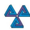
Logo design/update for leading architectural shade supplier
- Estado: Closed
- Premio: $290
- Propuestas recibidas: 5
- Ganador: WasabiStudio
Tablero de aclaración pública
-
moinjavedahmed
- 12 años atrás
PLZ CHECK P.M.
THANKS- 12 años atrás
-

megasodessa
- 12 años atrás
Please review #247 #307 #308 Thanks.
- 12 años atrás
-

a183rt
- 12 años atrás
#318
- 12 años atrás
-
a183rt
- 12 años atrás
i do
- 12 años atrás
-
a183rt
- 12 años atrás
i hope you like #306
- 12 años atrás
-
a183rt
- 12 años atrás
3d #310 #311 #312
- 12 años atrás
-
megasodessa
- 12 años atrás
Please review #247
- 12 años atrás
-
megasodessa
- 12 años atrás
#307 #308
- 12 años atrás
-

emilymwh
- 12 años atrás
Please check #252 #268 #281
- 12 años atrás
-
emilymwh
- 12 años atrás
Please check #252 #268
- 12 años atrás
-

mhdmirshad
- 12 años atrás
Review pls #230
- 12 años atrás
-

Arpit1113
- 12 años atrás
Please review #225
- 12 años atrás
-

bhetzkie
- 12 años atrás
Design Entry #197, updated.
- 12 años atrás
-

mainulislam85
- 12 años atrás
#159 Thanks.
- 12 años atrás
-

sabaadnan
- 12 años atrás
Hi ! Please check my layouts #158, #161 & #163.
- 12 años atrás
-
sabaadnan
- 12 años atrás
Thanks
- 12 años atrás
-

KumarSasi
- 12 años atrás
Plz check #157
- 12 años atrás
-
mhdmirshad
- 12 años atrás
Pls review #154 & #156. Design with 3D and without 3D. Thanks
- 12 años atrás
-
bhetzkie
- 12 años atrás
Please rate my design. entry #155
- 12 años atrás
-

addatween
- 12 años atrás
#106 the best, I like it. welldone
- 12 años atrás
-

ZemunDesign
- 12 años atrás
#108 and #110
Thanks- 12 años atrás
-
ZemunDesign
- 12 años atrás
#107
Thanks- 12 años atrás
-

Organizador del concurso - 12 años atrás
Thanks for the great work which is heading in the right direction. Some further feedback to assist further refine the design:
- We feel it important to stay with a fabric structure form rather than an abstract form as the logo element
- Furthermore, it's important that we use a more complex fabric form rather than simple sail shapes used by most of our competition
-We like the shadow which adds some depth/3D
Let me know if you have any questions or need further clarification- 12 años atrás
-
Organizador del concurso - 12 años atrás
To clarify further the minimization of the company name - we believe the "living" part of the name appeals to the wrong market so should be minimized - another approach we are considering might be to add "Fabric Architecture" beneath the name
- 12 años atrás
-

WasabiStudio
- 12 años atrás
IMHO adding "Fabric Architecture" into logo will make it to heavy. Minimalism is good. Take a look at n*ke, ap*le, and another big names. They keep logo simple...
- 12 años atrás
-
Organizador del concurso - 12 años atrás
It seems the previous message was unclear - we cannot drop the "living" part of the name - we just want to reduce the emphasis on this part either by using colour or lighter or font etc
- 12 años atrás
-
samiulbd
- 12 años atrás
Ok Sir
- 12 años atrás
-
WasabiStudio
- 12 años atrás
Hello
In our opinion shape of icon in your current logo is very good and unique. We tried to updated it with modern typography and better proportions. If you desire complete re branding please contact us so we can discus this.- 12 años atrás
-
Organizador del concurso - 12 años atrás
Thnx for the feedback - we do like the refinments you've made to our current design and the improved balance and style is a step forward - however, please see comments we just added in the public noticeboard
- 12 años atrás
-
Organizador del concurso - 12 años atrás
Please note that our current logo design (and the variations being submitted) is similar to our competitors and we wish to differentiate ourselves with the new logo. There are other fabric forms which you can view on our supplier webiste http://www.structureflex.com.au/ which could be incoporporated into a design. The mesh in the page header is attractive and the shapes of the membranes in the main photo and the tensile membrane picture would also make interesting elements as part of a new design
- 12 años atrás
-

foryoma
- 12 años atrás
please check#62
- 12 años atrás
-
Organizador del concurso - 12 años atrás
See comments previously posted
the current design of our logo (and the many variations that have been submitted) appeals more to the domestic homeowner client - which are not our target audience- 12 años atrás
-

manikmoon
- 12 años atrás
#54 - note that the actual name could be replaced with anything and is only a placeholder in the design.
- 12 años atrás
-
Organizador del concurso - 12 años atrás
Many designs are placing too much emphasis on the company name - please re-read the brief - we may change the company name in the future so this not be the focal element of the design.
Also, the current design of our logo (and the many variations that have been submitted) appeals more to the domestic homeowner client - which are not our target audience - we design and build high end architectural solutions for commercial and government clients.- 12 años atrás
Cómo comenzar con los concursos
-

Publica tu concurso Fácil y rápido
-

Consigue toneladas de propuestas De todo el mundo
-

Elige la mejor propuesta ¡Descarga fácilmente los archivos!