Freelancer: buanayakashima
Compartir:
Reportar entrada

REVISION LOGO

here i did a revision as you requested, if you need more changes, just tell me.
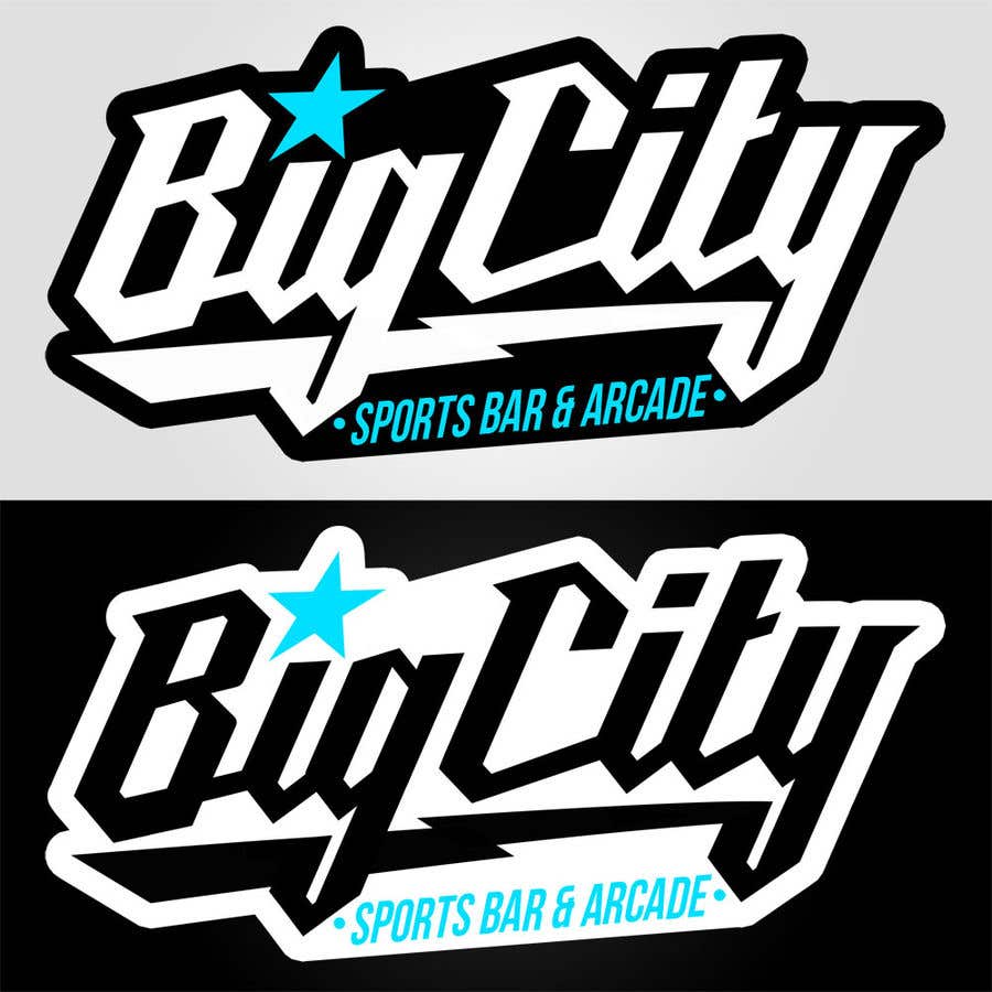
Participación en el concurso Nro.221 para                                                 Logo Rebrand
Participación Nro. 221

Tablero de aclaración pública

  • BigCityGamin
    Organizador del concurso
    • 3 años atrás

    Awesome, thank you for doing that! I think I actually like the way you had it before, but I do like the symmetrical bottom of the g and y. I also like it way more when the letters of Big City are white, but I need to be able to use this on both white and black surfaces. What if we revert back to the original “sports bar & arcade” sizing, including moving the black part back up so that the tips of the g and y still stick out below a little bit. What if you put a blue stroke around the entire image, that way we could keep the Big City in white at all times. Thanks again for all your help!

    • 3 años atrás
    1. buanayakashima
      buanayakashima
      • 3 años atrás

      aye, sir. wait a minute. i will do it.

      • 3 años atrás